텐서플로우 튜토리얼(https://www.tensorflow.org/tutorials/quickstart/advanced?hl=ko) 한국어 번역 문서입니다.
분류기의 기본 : 옷 데이터 분류하기
이번 가이드는 옷 이미지(스니커즈나 셔츠) 분류할 수 있는 뉴럴넷 모델을 학습해 보겠습니다. 바로 이해가 되지 않을 수 있지만, 텐서플로우 예제를 보고 빠르게 살펴 보겠습니다. 이 가이드는 tf.keras, 라는 고수준 API를 이용해 모델을 학습합니다.
from __future__ import absolute_import, division, print_function, unicode_literals

# TensorFlow and tf.keras
import tensorflow as tf
from tensorflow import keras

# Helper libraries
import numpy as np
import matplotlib.pyplot as plt

print(tf.__version__)
2.0.0
패션 MNIST 데이터셋 임포트
이 가이드는 Fashion MNIST](https://github.com/zalandoresearch/fashion-mnist) 데이터셋을 이용합니다. 이 데이터셋에는 70,000장의 흑백 이미지가 있고, 이들 이미지는 10개의 카테고리입니다. 저해상도(28 by 28 pixels) 이미지 이며 다음과 같습니다.
![]()
그림 1. 패션-MNIST 샘플 (by Zalando, MIT License).
패션 MNIST는 컴퓨터 비전 분야의 종종 “Hello, World"에 해당하는 MNIST 데이터셋입니다. 이 데이터셋은 손글씨숫자(0, 1, 2, etc.)에 대한 이미지입니다. 이 가이드는 예제 다양성을 고려하여 패션 MNIST 데이터셋을 이용하며 일반 MNIST보다 어렵습니다. 두 데이터셋은 상대적으로 크기가 작으며, 다양한 알고리즘 검증 작업에 사용할 수 있습니다. 코드를 테스트하고 디버그 하기 좋습니다.
6만장의 이미지로 뉴럴 네트워크를 학습며, 1만장의 이미지는 분류 정확도 측정에 사용합니다. 패션 MNIST는 텐서플로우에서 바로 임포트해 사용할 수 있습니다.
fashion_mnist = keras.datasets.fashion_mnist

(train_images, train_labels), (test_images, test_labels) = fashion_mnist.load_data()
Explore the data
모델 학습 전에 데이터셋 포맷에 대해 알아 보겠습니다. 60000만개의 이미지는 학습이미지로 사용하며, 각 이미지는 28 x 28 픽셀입니다.:
train_images.shape
(60000, 28, 28)
마찬가지로 60,000 레이블이 학습셋이 있습니다.
len(train_labels)
60000
각 레이블은 0과 9사이 범위의 숫자입니다.
train_labels
array([9, 0, 0, ..., 3, 0, 5], dtype=uint8)
10,000 이미지는 테스트셋입니다. 각 이미지는 28x28 픽셀입니다.
test_images.shape
(10000, 28, 28)
그리고 테스트셋은 10000 이미지 레이블을 포함합니다.
len(test_labels)
10000
데이터 처리
데이터는 네트워크 학습전에 전처리가 반드시 필요합니다. 만약 학습 셋에서 이미지를 검사하면 픽셀값은 0에서 255값 사이 범위내입니다.
plt.figure()
plt.imshow(train_images[0])
plt.colorbar()
plt.grid(False)
plt.show()
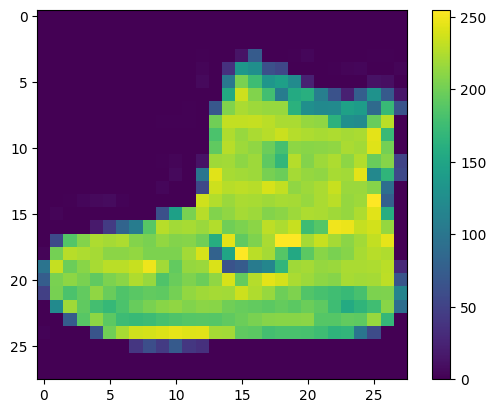
이러한 값은 신경 네트워크 모델을 만들기 전에 0부터 1까지의 범위로 스케일합니다. 그렇게 하려면 값을 255로 나눕니다. 학습셋과 테스트셋을 동일한 방식으로 사전 처리합니다.
train_images = train_images / 255.0

test_images = test_images / 255.0
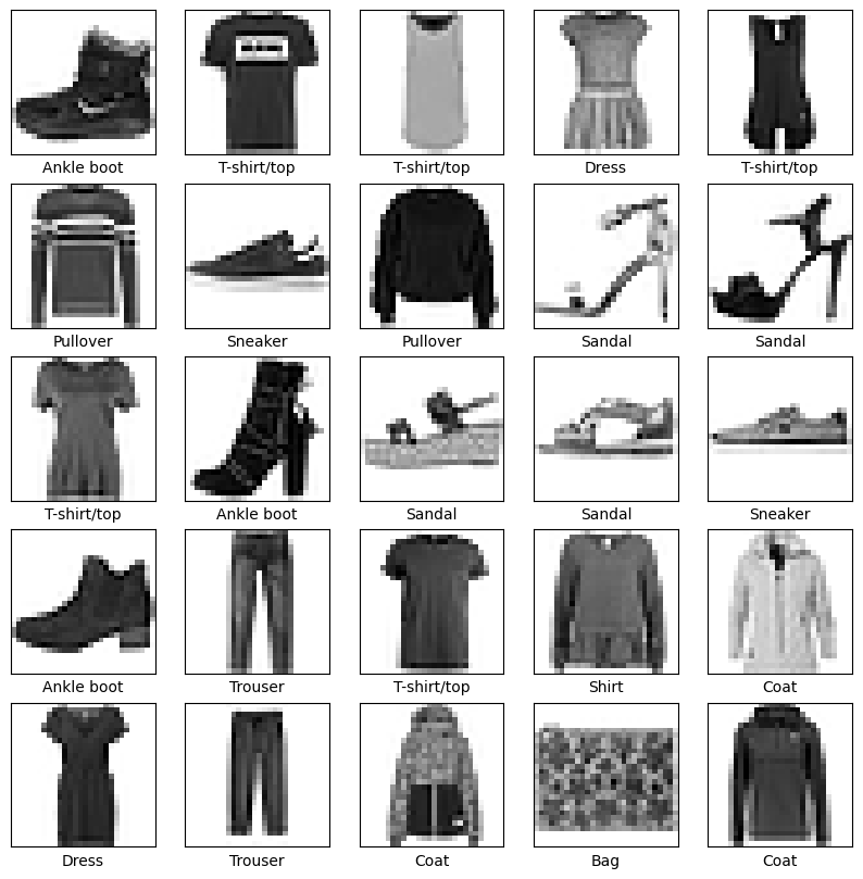
데이터가 올바른 형식이고 네트워크를 구축 하고 학습할 준비가 되었는지 확인하려면, 학습셋의 25개의 이미지를 표시할 수 있고, 각 이미지 아래에 클래스 이름이 표시 되는지 확인합니다.
plt.figure(figsize=(10,10))
for i in range(25):
    plt.subplot(5,5,i+1)
    plt.xticks([])
    plt.yticks([])
    plt.grid(False)
    plt.imshow(train_images[i], cmap=plt.cm.binary)
    plt.xlabel(class_names[train_labels[i]])
plt.show()
모델 빌드
뉴럴 네터워크를 빌드할 때 레이어 설정이 필요하고, 이후 모델을 컴파일합니다.
레이어 설정
뉴럴넷 레이어를 설정하겠습니다. 레이터는 데이터에 나타난 표현을 추출합니다. 대부분의 딥러닝은 간단한 레이어의 연결로 구성됩니다. 레이어 설정시 tf.keras.layers.Dense로 학습에 사용하는 파라메터를 설정합니다.
model = keras.Sequential([
    keras.layers.Flatten(input_shape=(28, 28)),
    keras.layers.Dense(128, activation='relu'),
    keras.layers.Dense(10, activation='softmax')
])
첫번째 네트워크에 (tf.keras.layers.Flatten) 2차원에서 1차원으로 변경합니다.(28x28픽셀 => 784픽셀). 이 레이어는 이미지에 픽셀 행을 분리 하고 정렬 하는 역할을 수행하며, 학습에 필요한 매개변수를 이용하지도 않으며, 단지 데이터 포맷만 변경할 뿐입니다.
픽셀을 펼칩니다. 데이터는 2개의 [ tf.keras.layers.Dense](https://www.tensorflow.org/api_docs/python/tf/keras/layers/Dense) 레이어로 설정했으며, 완전 연결(fully connected)되어 있습니다. 첫번째 Dense` 레이어는 128 노드(뉴런) 입니다. 두번째 레이어는 10개 노드인 소프트 맥스 레이어입니다. 이층은 10개 확률을 반환하며 확률 합계는 1입니다.
- 역자주 :
소프트 맥스 레이어는 멀티 화률값 예측에 사용하며, 출력 노드에는 0~1 숫자값을 출력하는소프트 맥스 함수를 사용함.
컴파일 모델
모델 학습 전에 설정이 좀 더 필요합니다. 다음은 모델 컴파일 단계입니다.:
- Loss 함수 —이 측정 함수 모델 학습시의 정확도를 측정하며, loss가 최소화 되고, 모델 학습이 잘 되도록 제어
- Optimizer —데이터에 대한 모델 업데이트를 할지를 결정
- Metrics —학습이나 테스팅 단계에서 모니터링 accuracy를 사용mfz.
model.compile(optimizer='adam',
              loss='sparse_categorical_crossentropy',
              metrics=['accuracy'])
모델 학습키기
신경망을 학습할 때 다음과단계가 요구 됩니다.:
- Feed the training data to the model. In this example, the training data is in the
train_imagesandtrain_labelsarrays. - The model learns to associate images and labels.
- You ask the model to make predictions about a test set—in this example, the
test_imagesarray. Verify that the predictions match the labels from thetest_labelsarray.
To start training, call the model.fit method—so called because it “fits” the model to the training data:
model.fit(train_images, train_labels, epochs=10)
Train on 60000 samples
Epoch 1/10
60000/60000 [==============================] - 5s 85us/sample - loss: 0.4978 - accuracy: 0.8245
Epoch 2/10
60000/60000 [==============================] - 4s 69us/sample - loss: 0.3798 - accuracy: 0.8624
Epoch 3/10
60000/60000 [==============================] - 4s 62us/sample - loss: 0.3411 - accuracy: 0.8762
Epoch 4/10
60000/60000 [==============================] - 4s 61us/sample - loss: 0.3164 - accuracy: 0.8838
Epoch 5/10
60000/60000 [==============================] - 4s 61us/sample - loss: 0.2956 - accuracy: 0.8902
Epoch 6/10
60000/60000 [==============================] - 4s 64us/sample - loss: 0.2815 - accuracy: 0.8955
Epoch 7/10
60000/60000 [==============================] - 4s 65us/sample - loss: 0.2691 - accuracy: 0.9009
Epoch 8/10
60000/60000 [==============================] - 4s 62us/sample - loss: 0.2579 - accuracy: 0.9029
Epoch 9/10
60000/60000 [==============================] - 4s 63us/sample - loss: 0.2485 - accuracy: 0.9062
Epoch 10/10
60000/60000 [==============================] - 4s 60us/sample - loss: 0.2388 - accuracy: 0.9100

<tensorflow.python.keras.callbacks.History at 0x7fefe642a860>
모델 학습을 진행하고 나면, 손실과 정확도의 측정 결과가 표시됩니다. 이 모델은 학습 데이터에 대한 정확도가 약 0.88%입니다.
정확도 평가하기
다음으로 학습된 모델을 테스트 데이터셋에 적용해 보겠습니다.
test_loss, test_acc = model.evaluate(test_images,  test_labels, verbose=2)

print('\nTest accuracy:', test_acc)
10000/1 - 1s - loss: 0.2934 - accuracy: 0.8830

Test accuracy: 0.883
테스트 셋의 정확도를 학습 셋의 정확도에 비해 다소 낮음을 확인할 수 있습니다. 이 차이는 학습 정확도와 테스트 정확도간의 차이로 오버피팅에 해당합니다. 오버피팅은 학습 데이터에 나타나지 않은 새로운 입력으로 인한 성능 저하입니다.
예측하기
모델 학습을 할때, 어떤 이미지에 대한 예측율(predictions)을 이용할 수 있어야 합니다.
predictions = model.predict(test_images)
모델은 학습셋의 각 이미지에 대해 라벨을 예측했습니다. 첫번째 예측(prediction)을 보겠습니다.
predictions[0]
array([1.06123218e-06, 8.76374884e-09, 4.13958730e-07, 9.93547733e-09,
       2.39135318e-07, 2.61428091e-03, 2.91701099e-07, 6.94991834e-03,
       1.02351805e-07, 9.90433693e-01], dtype=float32)
배열에는 10개의 예측과 관련한 신뢰도(confidence) 숫자를 포함합니다.
- 역자주 : 신뢰도는 라벨의 분류를 얼마나 신뢰할 수 있는지에 대한 확률값입니다.
가장 높은 신뢰도에 대한 라벨을 확인해 보겠습니다.
np.argmax(predictions[0])
9
모델은 발목 부츠(ankle boot) 또는 class_names[9]라고 확신하고 있습니다. 테스트 라벨을 보면 이 분류는 정확함을 확인할 수 있습니다.
test_labels[0]
9
클래스 10개에 대한 그래프를 확인 하려면 다음 예제를 작성해야 합니다.
def plot_image(i, predictions_array, true_label, img):
  predictions_array, true_label, img = predictions_array, true_label[i], img[i]
  plt.grid(False)
  plt.xticks([])
  plt.yticks([])

  plt.imshow(img, cmap=plt.cm.binary)

  predicted_label = np.argmax(predictions_array)
  if predicted_label == true_label:
    color = 'blue'
  else:
    color = 'red'

  plt.xlabel("{} {:2.0f}% ({})".format(class_names[predicted_label],
                                100*np.max(predictions_array),
                                class_names[true_label]),
                                color=color)

def plot_value_array(i, predictions_array, true_label):
  predictions_array, true_label = predictions_array, true_label[i]
  plt.grid(False)
  plt.xticks(range(10))
  plt.yticks([])
  thisplot = plt.bar(range(10), predictions_array, color="#777777")
  plt.ylim([0, 1])
  predicted_label = np.argmax(predictions_array)

  thisplot[predicted_label].set_color('red')
  thisplot[true_label].set_color('blue')
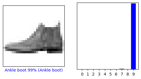
0번째 이미지의 prediction 배열을 보겠습니다. 정확히 라벨을 예측하면 파랑색, 오분류라면 빨강색으로 표시합니다. 숫자(100을 벗어남)는 예측된 라벨의 퍼센테이지입니다.
i = 0
plt.figure(figsize=(6,3))
plt.subplot(1,2,1)
plot_image(i, predictions[i], test_labels, test_images)
plt.subplot(1,2,2)
plot_value_array(i, predictions[i],  test_labels)
plt.show()
i = 12
plt.figure(figsize=(6,3))
plt.subplot(1,2,1)
plot_image(i, predictions[i], test_labels, test_images)
plt.subplot(1,2,2)
plot_value_array(i, predictions[i],  test_labels)
plt.show()
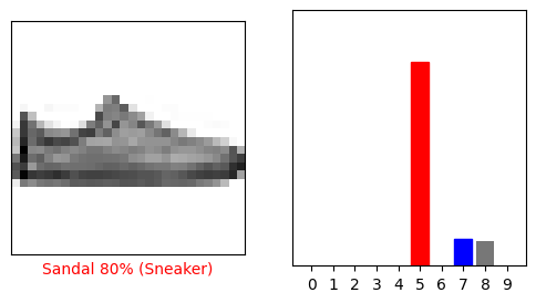
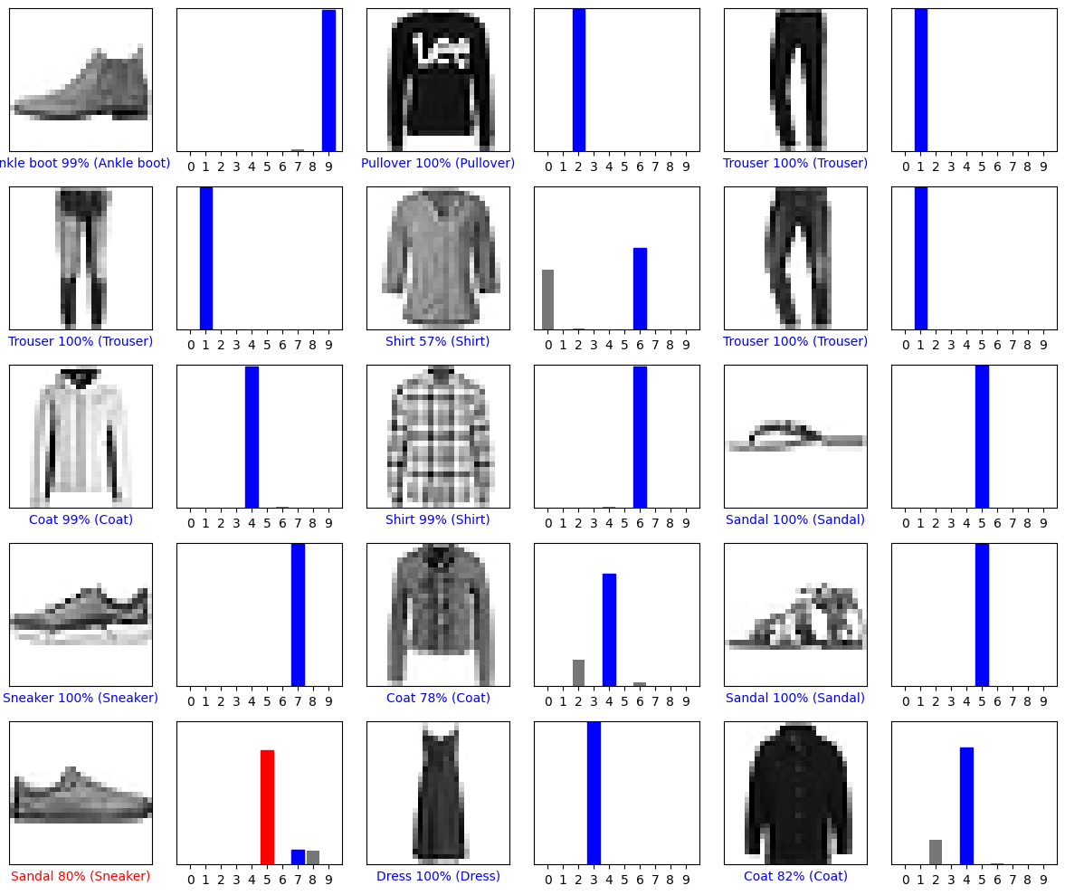
몇개의 이미지를 그려보겠습니다. 모델은 매우 확실한 경우에도 잘못 예측할 수 있음을 유의해야합니다.
# Plot the first X test images, their predicted labels, and the true labels.
# Color correct predictions in blue and incorrect predictions in red.
num_rows = 5
num_cols = 3
num_images = num_rows*num_cols
plt.figure(figsize=(2*2*num_cols, 2*num_rows))
for i in range(num_images):
  plt.subplot(num_rows, 2*num_cols, 2*i+1)
  plot_image(i, predictions[i], test_labels, test_images)
  plt.subplot(num_rows, 2*num_cols, 2*i+2)
  plot_value_array(i, predictions[i], test_labels)
plt.tight_layout()
plt.show()
마침네, 학습 모델을 단일 이미지에 대한 예측에 사용할 수 있게 되었습니다.
# Grab an image from the test dataset.
img = test_images[1]

print(img.shape)
(28, 28)
tf.keras 모델은 배치 수행시, 이미지 라벨 예측 성능을 최적화 하는데 사용합니다. (단일 이미지라도 리스트에 추가 필요)
# 단일 이미지라도 배치에 추가해야함.
img = (np.expand_dims(img,0))

print(img.shape)
(1, 28, 28)
이미지의 라벨을 정확히 예측할 수 있는지 보겠습니다.
predictions_single = model.predict(img)

print(predictions_single)
[[1.4175281e-04 8.5218921e-14 9.9798274e-01 1.7262291e-11 1.3707496e-03
  1.4081123e-14 5.0472573e-04 6.2876434e-17 3.6248435e-09 1.8519042e-13]]
plot_value_array(1, predictions_single[0], test_labels)
_ = plt.xticks(range(10), class_names, rotation=45)
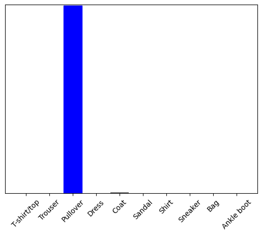
model.predict 는 리스트에 있는 하나의 리스트를 반환합니다. 데이터의 배치에서 각 이미지는 하나의 리스트입니다. 모델은 다음과 같이 라벨을 예측했습니다.
np.argmax(predictions_single[0])
2